Helping Your Business Grow Online & Offline.
Marketing, technology, and advisory services tailored to small businesses.
Professional Services
Looking for an effective marketing and strategy partner?

If you have a web project and are looking for someone to partner with, we’re happy to help. Our team is passionate about building great websites for people. We’re experts in design and development, but more importantly we can develop the …
Read More
Your ecommerce website should be easy to manage, secure and scalable. That’s where we come in. Let us help you build an ecommerce website that will give your customers a great shopping experience, while streamlining and optimizing the whole …
Read More
With proper SEO best practices, your website can be found on the first page of Google search results. Our team of experts will help you optimize your website for keywords and phrases to ensure that you are reaching potential customers who …
Read More
A well-thought-out marketing strategy is the foundation for success. With our full marketing operation offerings you can drive more leads, increase conversions, and boost sales to take your business to the next level.
Read More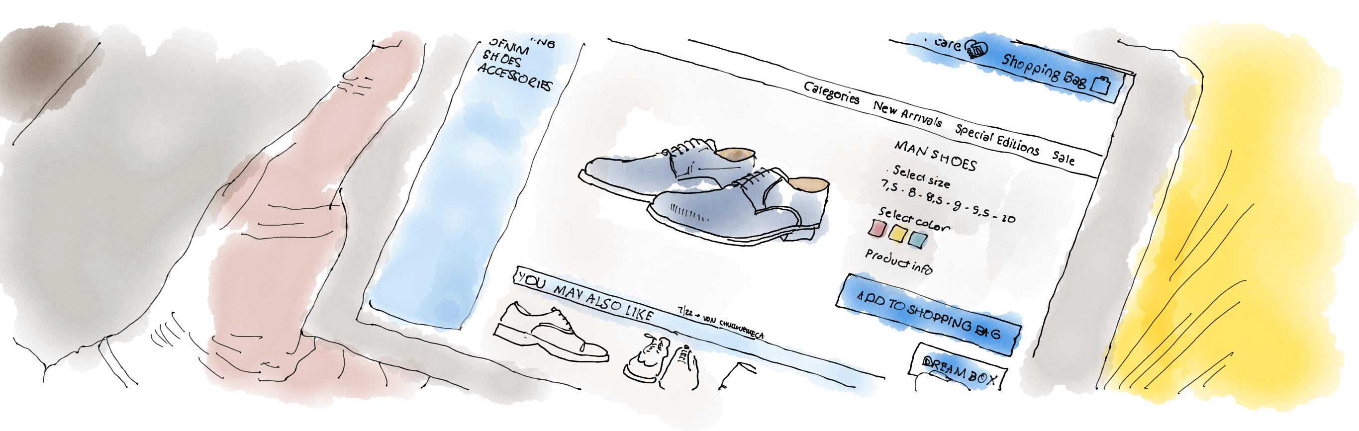
From SEO and content marketing to email campaigns and social media, we’ll help you create a tailored ecommerce marketing plan to drive more qualified traffic to your store, convert visitors into customers, and engage existing customers for …
Read More
Leverage the power of social media to connect with your customers, build relationships, increase brand awareness and drive website traffic. We’ll help you create effective campaigns for each platform so you can reach more people, engage …
Read More
Tap into the full potential of search engine traffic with our comprehensive search marketing services. Our team of experts will help you create and implement optimized campaigns that drive more qualified visitors to your website and convert …
Read More
Develop your visual identity with logos, colors, typography, and design components to make your brand stand out from competitors. We create unique, eye-catching branding and design assets to help you make a lasting impression on your target …
Read More
Sambuno surpassed our expectations and their collaborative process created a solid foundation for our launch.
– Charles Solomon, Global Industrial Water

About Sambuno
Sambuno is a marketing operations consultancy that designs, implements, & tracks unique growth trajectories for clients.

Marketing Operations, simplified. We are an End-to-End Marketing Partner for clients. We collaborate closely with our clients to foster business growth by leveraging a comprehensive range of marketing channels and implementing the most effective strategies. As a boutique marketing, technology, and consulting firm, we specialize in serving small and medium-sized businesses with customized solutions tailored to their unique needs and …
Sambuno did a great job building out our marketing funnels. I have since recommended them to several of our clients.
– Kent Scherler, Scherler Technology Group

Marketing Journal
-
Why is Marketing Expensive?
Marketing: The pulse, the heartbeat, the lifeblood of any thriving business. Yet, many perceive marketing as a hefty line item on their budget sheet, often questioning its cost implications. Understanding marketing expenditure and its impact on business growth is essential to justify the investments made in this arena. As the famous saying goes, “It takes...
-

The Million-Dollar Blueprint: Scaling a Foundation Repair Business from Scratch
Every business has a story, a journey from an idea to reality. In this post, we’ll be diving into our own journey – the tale of how we grew a foundation repair business from $0 to a staggering $5 million a year over the course of three years. This journey wasn’t an easy one, but...